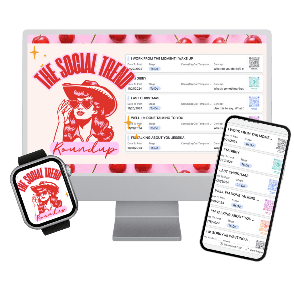
The Socially GROWING Membership
Are you ready for a membership that has all of the social media training you'll ever need?! I was tired of searching for hours on YouTube, and not being able to ask coaches questions IRL. So I decided to take everything that I've learned and create a membership that you will LOVE!!!
Access my powerful resources to boost your social confidence & engagement

NEED AN INSTAGRAM BOOST?
If You’re Not Seeing The Growth You’d Like On Instagram, It Might Be Time For An IG Bio Audit!

GROUP SETTING NOT YOUR THING? LET'S HAVE A PRIVATE SOCIAL MEDIA COACHING SESSION THEN!
Are you ready for a customized experience? Maybe it's time for private coaching!

STRUGGLING TO MOVE YOUR LEADS INTO CUSTOMERS?
Your audience needs to remember you, connect with you, and understand the benefits of acquiring your product or service. How? My free training will help.
SUBSCRIBE TO THE SOCIAL NEWSLETTER
Get all my tips, tricks, and strategies sent straight to your inbox! Plus, be the first to know about discounts, giveaways, and more.
The Socially Growing Membership
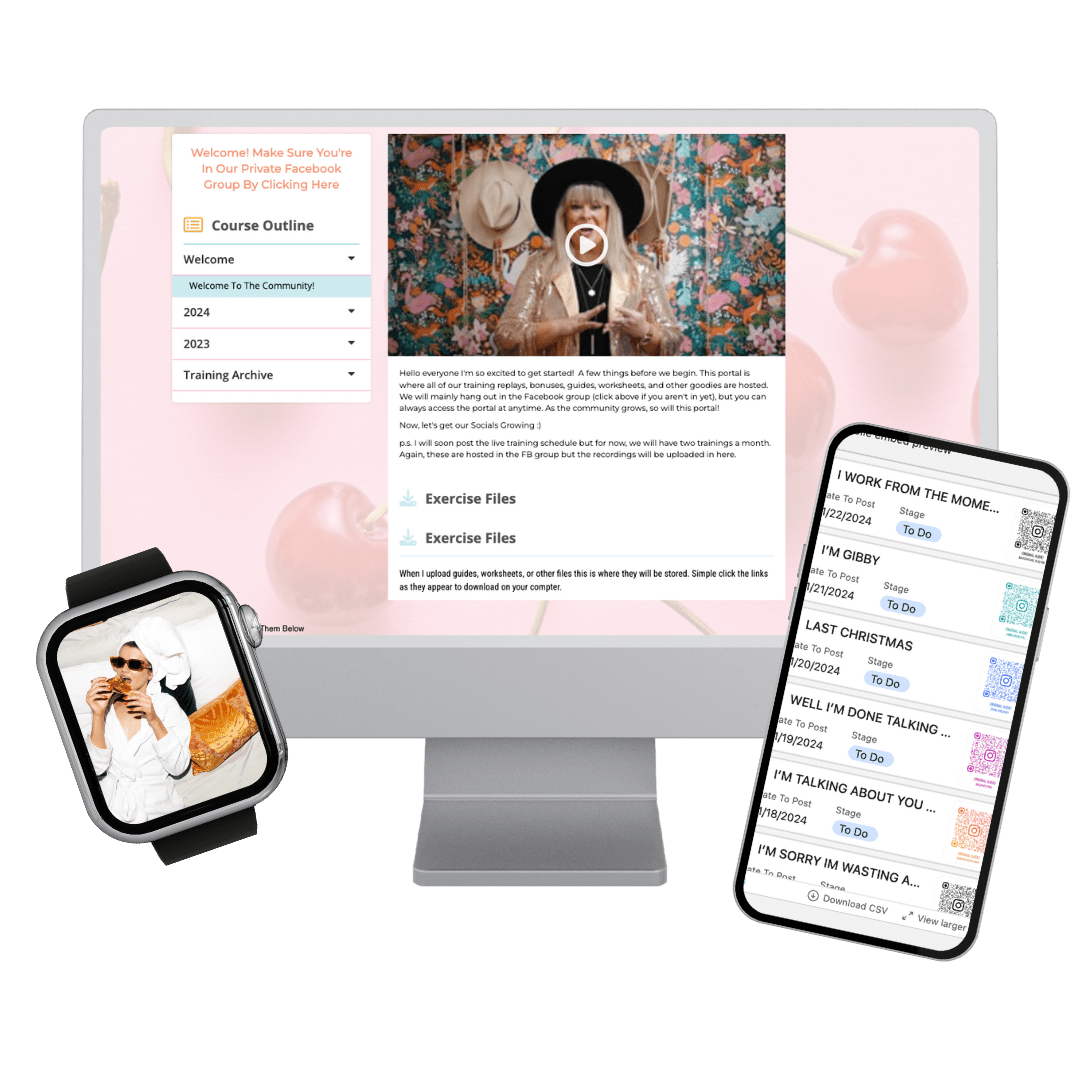
A Membership & Community That Will Help You Boost Your Social Confidence To Grow Your Connections Online
Don’t get left behind when it comes to technology and apps. You have control of your phone, not the other way around.
This membership and community will become your go-to place for all the latest trends, tips, and strategies that will help you not only grow your social accounts, but grow your social confidence!
Remember, confidence = connection
Stay up-to-date with social media, post engaging content, and connect with your ideal audience.
MY FAVORITE TOOLS
FLICK
Gosh! This is one of my favorite scheduling platforms with great tools, Ai creation, and so much more.
Christian Planner
This is a planner that was recommended to me by my sister and I absolutely love it!
Metricool
This is the scheduling tool I use to run all of my client reports.
Vocable
Streamlines your entire content operations, making it easy to ideate, plan, draft,
collaborate and optimise multi-channel content in one centralized workflow.
HoneyBook (25% off)
I couldn't run my business without this program! This is where I run all of my client invoices, emails, task lists, zoom calls, and projects. It also works with Quickooks for easy bookkeeping.
Podsqueeze
The best Ai tool for podcasting!
Riverside
Film all your videos for YouTube, Podcasting and more. Easy edits, professional audio, and easily publishing to Spotify.
Descript
Quick video editing for long form videos. Remove filler words, add captions, add B-roll, and so much more.
Poppy Ai
Literally my favorite Ai Tool out there! Using it for everything!
***I make a small commission on any of these purchases***

© 2026 Socially Stetson | All rights reserved.
